

How does the color of wallpaper affect mood and the atmosphere of an interior
Wallpaper colour as the foundation of a room's mood
Contemporary interiors increasingly rely on carefully considered colour schemes. The colours on our walls influence more than anything else how we feel in a given room. Wallcolors wallpapers are designed around balanced colour palettes that do not overwhelm, yet give interiors character. A well-chosen wallpaper colour can calm, energise or support concentration, so it is worth treating it as one of the key elements of a design.

Light wallpaper colours and their impact on everyday comfort
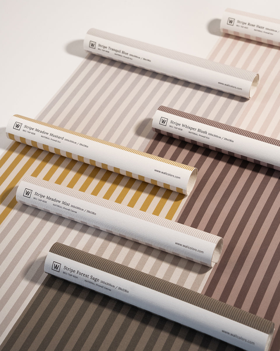
Light wallpapers in shades of beige, off-white or soft grey bring a sense of lightness and spaciousness to a room. These are colours that promote calm and create an impression of order. They work perfectly in bedrooms and living areas, where we want a peaceful, harmonious atmosphere. Light-toned Wallcolors wallpapers make an ideal backdrop for natural materials and soft textiles, creating interiors where it is easy to relax.
Warm wallpaper shades and a sense of cosiness
Warm colours such as sandy beiges, caramel browns or subtle shades of terracotta create an atmosphere of security and comfort in a room. Wallpaper in such a palette makes a space feel friendlier and more homely. It is an excellent choice for living rooms and bedrooms, where cosiness and a sense of closeness matter. In modern interiors, warm Wallcolors wallpapers are often paired with neutral walls and Benjamin Moore paints, with one stronger accent colour that adds depth and expressiveness to the interior.
Cool wallpaper colours and their calming effect
Cool shades such as muted blues, subdued greens or soft greys have a calming, ordering effect. Wallpapers in these tones promote concentration and mental rest. They work very well in bedrooms, home offices and modern living areas, where balance and harmony are key. Wallcolors wallpapers in a cool colour palette help create interiors that are calm, yet at the same time very elegant and contemporary.
Bolder wallpaper colours as a deliberate emotional accent
More intense wallpaper colours have a great deal of impact, so they are best used with care. Deep navy blues, bottle greens or rich earth tones can add energy and character to a room while building a sense of stability. In modern interiors, a wallpaper in a bolder colour most often appears on a single wall, becoming a distinct but controlled accent. The remaining surfaces are best kept in calmer shades to maintain balance and visual comfort.
Wallpaper, Arch and DOTS as tools for creating mood
The colour of a wallpaper can be further emphasised by combining it with other wall decorations. Arch elements make it possible to separate colour zones and give the interior a soft, architectural form that shapes how the space is perceived. DOTS decorations and DOTS Lighting, in turn, can strengthen the emotional character of an interior through subtle colour accents and light. Such combinations let you consciously steer the mood of a room without a sense of excess.
Wallpaper colour and the function of the room
Every interior has its own function, and the colour of the wallpaper should support it. In bedrooms, colours that encourage calm and regeneration work best. In living rooms, wallpapers can create an atmosphere of openness and comfort, especially when combined with Benjamin Moore paints in neutral shades and one expressive colour accent. In kitchens and dining rooms, wallpapers can warm up the space and complement tiles, giving the interior a more homely character without giving up a modern aesthetic.
Choosing your wallpaper colour consciously, for years to come
The colour of a wallpaper is a decision that affects everyday well-being. It is therefore worth choosing shades that not only fit current trends but above all suit our needs and lifestyle. Wallcolors wallpapers offer colour palettes designed with balance and timelessness in mind, so the interior keeps its character and comfort for a long time.


