

Powder pink and bottle green. How to combine them in an interior and maintain harmony
Powder pink and bottle green as a deliberate contrast
The secret to successfully pairing these two colours lies in their temperament. Powder pink is soft, light and illuminating, while bottle green brings depth and elegance to the interior. Together they create a harmonious composition in which neither colour dominates, as long as the right proportions are maintained. Wallcolors wallpapers support such pairings perfectly, because their colour palettes are balanced and natural.

How to use wallpaper in this colour combination
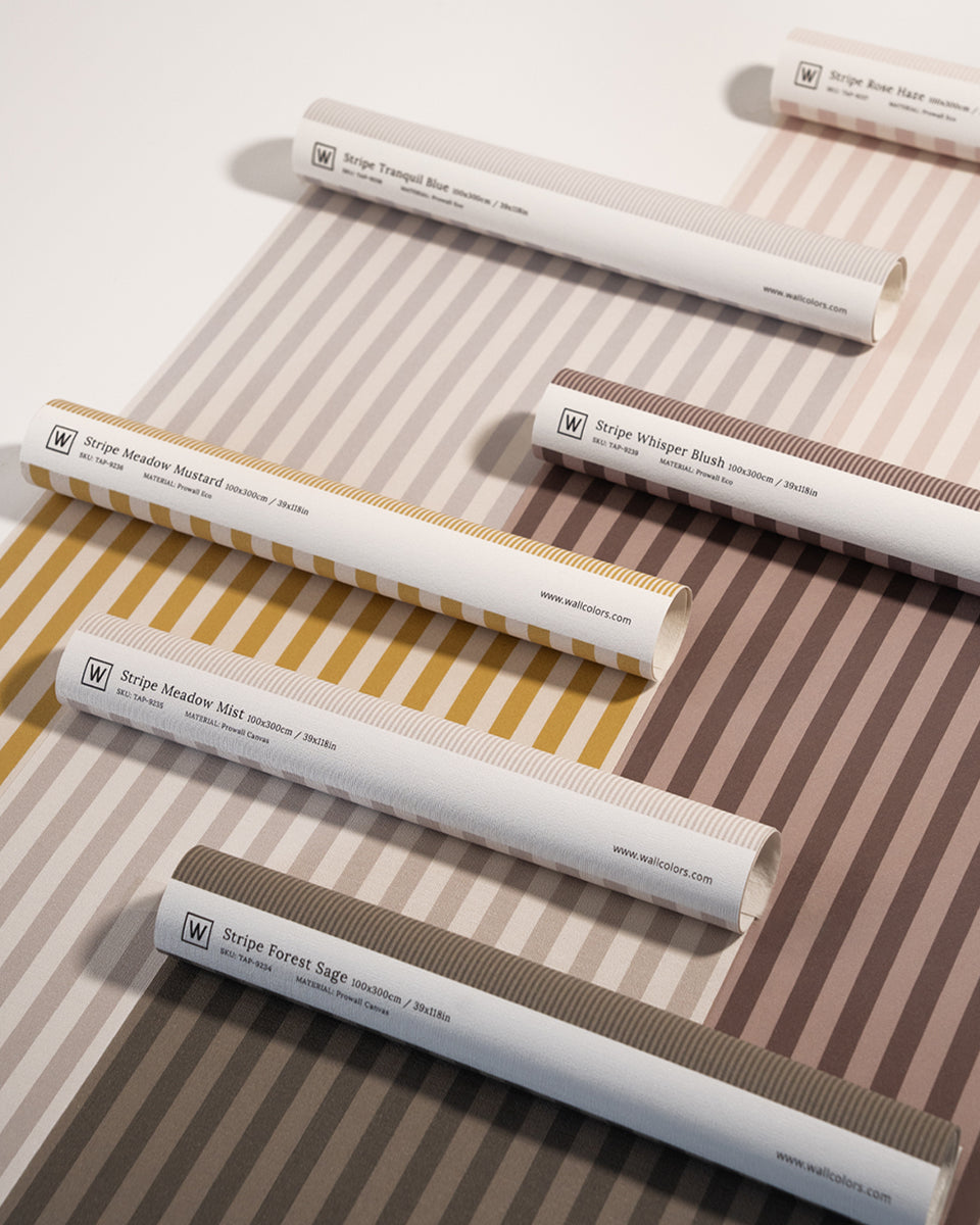
Wallpaper is one of the best ways to combine powder pink and bottle green without a feeling of overload. The pattern can gently blend both colours or be based on just one of them, while the other appears in accessories or on the remaining walls. Wallcolors wallpapers with an illustrative, soft character let you create a cohesive backdrop that naturally ties the whole arrangement together.
Powder pink as the base of the interior
Powder pink works wonderfully as a base colour. It brightens the space, adds lightness and creates a pleasant, calm backdrop. Combined with a Wallcolors wallpaper in a subtle pattern, pink can appear on the remaining walls, forming a harmonious base for stronger colour accents. This solution works particularly well in living rooms and bedrooms, where visual comfort matters.
Bottle green as an accent with character
Bottle green looks best as an accent. It can appear on a single wall, in the wallpaper pattern or in decorative elements. It is a colour that adds elegance and depth to an interior, so it is worth using with sensitivity. Wallcolors wallpapers in shades of green go perfectly with powder pink, creating a composition that is expressive yet still very calm.
A living room in powder pink and bottle green
In a living room, this colour combination looks exceptionally elegant. A Wallcolors wallpaper can become an accent on one wall, for example behind the sofa, while the remaining walls are kept in powder pink. In living rooms, it is worth pairing the wallpaper with Benjamin Moore paints available at wallcolors.com, choosing a light, powdery base and one deeper green accent that will give the interior character and elegance.
A bedroom in this colour scheme
In a bedroom, powder pink and bottle green create an atmosphere conducive to calm and rest. A wallpaper with a delicate motif, placed on the wall behind the bed, can combine both colours in a subtle way. Powder pink brings softness, while green gives a sense of stability and peace. Wallcolors wallpapers fit this aesthetic perfectly without overwhelming the interior.
Natural materials as the link between colours
For the combination of powder pink and bottle green to be truly harmonious, it is worth reaching for natural materials. Wood, linen fabrics, ceramics and soft textiles help soften the contrast and make the interior feel cosier. Wallcolors wallpapers provide a calm backdrop for such combinations, allowing the colours to resonate in an elegant way.
Arch as a soft form that brings order to colour
Arch elements work great in arrangements based on contrasting colours. The soft, rounded form allows you to gently connect powder pink with bottle green and gives the interior a more architectural, refined character. Arch can highlight the wallpapered area or subtly separate a part of the interior.
DOTS and DOTS Lighting as a subtle finishing touch
DOTS decorations and DOTS Lighting bring lightness and rhythm to the interior. Small wall accents and soft light help balance the colour combination and give the arrangement a pleasant depth. DOTS Lighting works particularly well in the evening, highlighting the texture of the wallpaper and building a moody atmosphere.
Cohesion instead of colour dominance
The most important rule when combining powder pink and bottle green is to maintain balance. Neither colour should dominate completely. A Wallcolors wallpaper lets you naturally combine these shades in one composition, so the interior stays cohesive and harmonious rather than overwhelming.
A duo that never goes out of fashion
Powder pink and bottle green is a combination that works in many interior styles and never loses its relevance. A well-chosen wallpaper, a calm colour base and subtle details let you create an interior that is elegant, cosy and truly timeless. Wallcolors wallpapers, complemented by Arch elements and DOTS decorations, help build a space in which contrast becomes harmony.


